TLDR; Delivering a good outcome for customers and the business under significant time pressure, for the UK’s fastest growing car insurance product.
What is Aviva Zero?
Aviva Zero is a car insurance product built on the idea of offsetting the carbon produced by driving the car. A carbon concious car insurance product.
How does the product work?
When someone buys car insurance they tell the insurer;
- which car they’ll be driving
- how many miles they’re going to drive it
With that information, the insurer can work out how many grams of CO2 will be produced during the lifespan of the policy. And with Aviva Zero, those grams will be offset via the purchase of carbon credits.
During the time I worked on Zero, it became the UK’s fastest growing car insurance brand. Going from 0 customers to 163k paying monthly customers with a Gross Written Premium of £191,000,000 by the time I left.
Project brief

Build online functionality to allow customers to make changes to their car insurance policy instantly. (The current process involves calling up or emailing to receive a quote, which can take days.)
The business was keen to achieve this as call center costs are high and the more customers that self-serve, the more money the business saves.
Tight deadlines require pragmatism
In a perfect world every project would have time and budget for a full UX process. Unfortunately we don’t always have that luxury! This project was budgeted and planned for a set release date – meaning I had to adapt the standard UX process to fit the deadline.
Below I’ve outlined the process I took;
- Stakeholder onboarding, clarification of success
- Pragmatic discovery
- Rapid ideation and wireframing
- Early stakeholder engagement
- Unmoderated testing
- Iterative improvement
- Supporting build
- Post-launch improvements
You can skip to the bit’s you’re interested in by clicking the links
Stakeholder onboarding, clarification of success
Although it can feel like a rush at the start of a project with a tight deadline – it’s useful to take a moment and make sure that everyone is on the same page. So before we began I brought key stakeholders and practitioners (product owner, developers, etc…) together for a workshop to agree on ways of working.
During the workshop, we agreed that we’d attempt to deliver an initial MVP as soon as possible and then iterate, rather than one large release. We agreed we’d check in early and often, and the structure of those check-ins. We also agreed on what success looks like:
- Be built on time (and therefore budget)
- Reduce stress on call center
- Be a good experience for customers
You’ll notice that time and budget concerns are at the top of the list. These constraints make the challenge of delivering a great customer outcome a little more interesting!
To measure customer experience we agreed to use TNPS (Transactional Net Promoter Score). This involves customers answering questions in a survey that contributes to an overall agregated score, as well as gathering verbatims about why they have given those scores.
It is not a perfect measure since you cannot attribute a change in the score to any single change made in the journey but it’s certainly better than nothing! And in this case, if we see a change in the score right after the journey is released then we can combine that info with verbatims to inform our evaluation of success.
Pragmatic discovery
Due to the rapidly approaching deadlines, there was no time for a proper discovery phase. So instead, we did the best with what we had…
Read across
I went back through our research archives to find insight from research conducted on other Aviva products. Collaboratively with the research team we pulled out insights that could apply to Aviva Zero.
For example, it was identified in previous research that users making a change often leave it until the day of the change or the day before to alert their insurer. And using that insight we were able to create a shortcut for people when choosing when they want their change to take effect.

(A radio select allows the majority of people to choose the right date without opening a date picker)
Competitor review
As well as research on our own products, I was able to conduct a small competitor review. Most of our competitor’s journeys were only accessible via logging in and so we were limted to a select few, but this exercise helped us gain confidence in the general structure and hierarchy that is prevalent across the industry.
Rapid ideation and wireframing
Collaboratively with the product owner, UX researchers and lead engineer, we used the insights we pulled together to draw out some initial concepts.
We used pencil and paper to draw concepts which allowed those without technical wireframing skills to get involved and express their ideas, plus you can draw boxes on a page very quickly and rub it out almost as quickly. It was easy to cut the paper up and play with the hierarchy.
The first set of designs were pulled together in one day and the whole group was aligned around our direction and energised to move forward.
Using those sketches, it was easy to transfer into Figma and continue to refine, digging further into the read-accross insights.
Early stakeholder engagement
We’ve all been there – a stubborn stakeholder challenges the project’s progress. After years working with various types of stakeholders, I believe in the importance of involving them early to help them buy in.
And so, in this project our key stakeholders were involved early and often – just as agreed in the kickoff workshop. I set up a weekly check-in session to keep everyone up to date, and allow space for comments and suggestions.
The first of these happened just after we had created the first digital wireframes. I believe these sessions allowed for a feeling of mutual respect between the team of practitioners and the project’s stakeholders, as well as giving us all a platform to collaboratively improve the designs. And importantly, it kept the project moving with as little friction as possible. This especially important for a project with such tight timelines.
Unmoderated testing
Moderated testing would have been preferable but unfortunately it would take too much time to recruit the participants, run the sessions and conduct the analysis. We could not fit it in.
Instead, we ran remote unmoderated testing via an online platform. This allowed us to hire from the existing pool of participants (quickly), and even use some helpful tools like AI transcript generation to identify when participants had mentioned certain words or phrases, and group comment types.
For example, we were able to identify an issue around the display of monetary figures on the quote page, by targetting the word “payment” in the transcripts. Test participants had struggled to interpret the meaning of figures, and didn’t understand how much they would need to pay today in order to make the change to their policy.
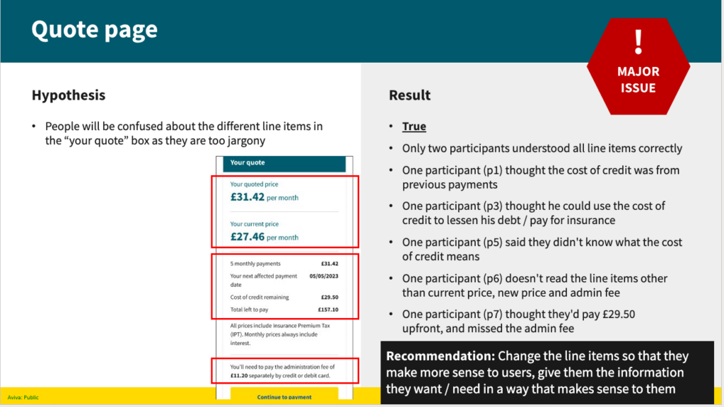
Above: a slide from the research pack, detailing some of the issues participants were having with the playback of price information.
Iterative improvement
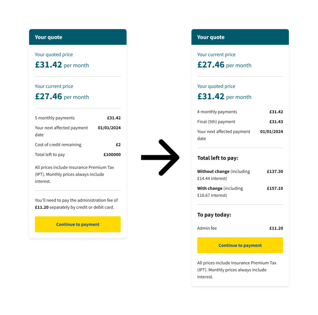
After our first round of testing we had identified some juicy problems, and we attempted to solve them in preparation for the second round of testing.
You can see below that we removed the “cost of credit remaining” line and replaced it with a “total left to pay” section, as well as including a new section which outlines clearly what the customer would need to pay right now. These decisions were made easy after watching the participants struggle with these parts of the page.
Then we tested again.
After the second round of testing, we made further adjustments (to the price box, and elsewhere) and went back to testing. And again, we uncovered potential improvements which we included in subsequent prototypes.
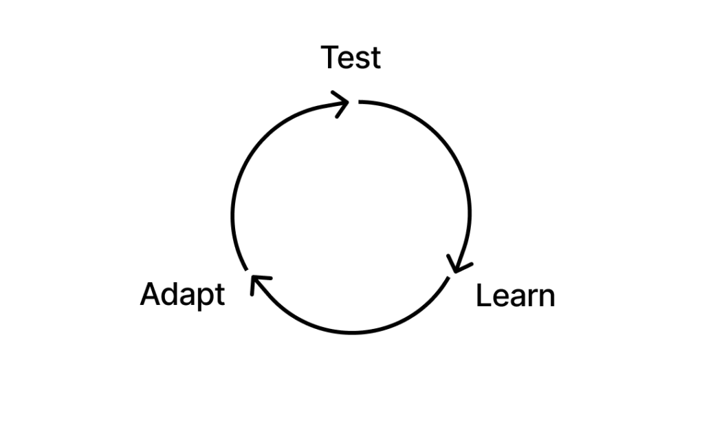
And then we tested again, and again.
After 4 rounds of testing we arrived at a version that was more understandable, and easier to digest than what we started with. You can see the progression below.
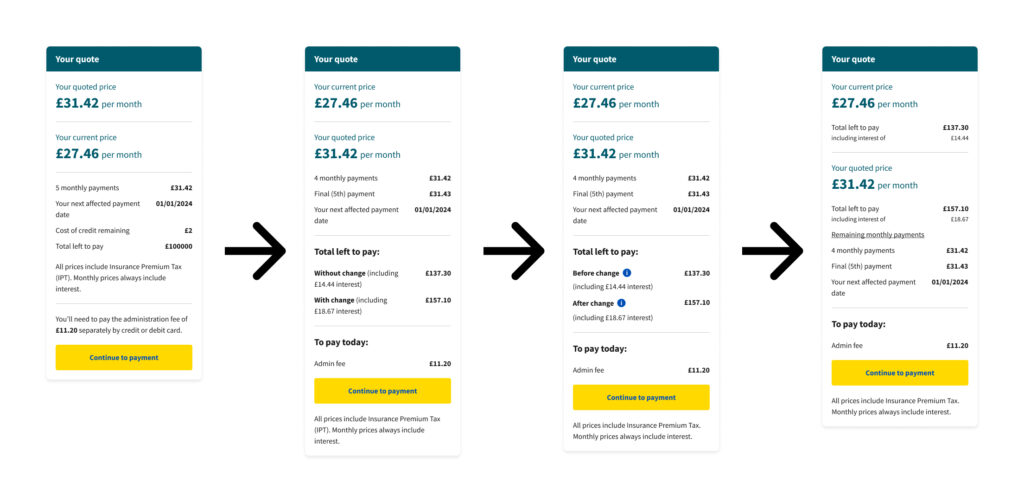
By the fourth round, we had determined that the “to pay today” section was useful, and still phrased “cost of credit remaining” as “total left to pay” – but uncovered that grouping that information with the monthly prices helped people digest it.
In the fourth round of testing, all participants said the information around prices was easy to understand – a vast improvement on what we saw in round 1!
Supporting build
After a couple of rounds of testing, pressure was on to get started on build.
Simultaneously building and testing means it is incredibly important that developers are kept in the loop.
The lead developer and I agreed that each dev would be able to attend at least one user testing session in order to understand the process we’re taking and that i’d attend dev ceremonies in order to answer questions about what’s changing and why.
As we built the journey, it was important to be as flexible as possible with designs (i.e. if a small design tweak can save days of development, let’s be pragmatic and flex). Compromise like this can foster a healthy relationship with developers which can be worth it’s weight in gold in future projects!
With these structures in place, the team was able to adapt and pivot at short notice which gave me flexibility to iterate and improve designs as and when we uncovered new insights through research.
Post-launch improvements
The initial launch was a Minimum Viable Product (MVP) in order to achieve our target release date. But once that was out in the wild we continued to iterate and improve for subsequent months.
Outcomes
Post-launch we continued to monitor the performance of the journey alongside other projects and continuous improvement. Our aim at the beginning of the project was to build functionality that would let customers make changes to their policy without phoning up the call center. We achieved that goal (31% of changes in the first month after launch were via the online journey, up to 48% in month two and 53% after three months).
It was also important that the journey was delivered on time and on budget and as a result of pragmatic ways of working and strategic planning. We achieved that goal too (MVP journey was delivered on the week targetted at the start of the project, budget not exceeded).
But there are some more nuanced outcomes to keep an eye on too….
30% less complaints, +25 to +34 in TNPS
We used TNPS (Transactional Net Promoter Score) as a measure of customer satisfaction and saw a marked improvement in the score relating directly to changes, and our overall score for the product. It went from +25 to +34 in the week preceding release, and overall TNPS went from +23 to +29 in the same week. This is a jump outside the normal range of fluctuation.
We also saw a 30% drop in the number of complaints featuring the words “change”, “edit” and “update”, and a 7% drop in complaints overall.
In the following weeks we saw that these changes were not a blip, TNPS continued to hover around +33/+34 and complaints volume did not return to it’s original line. And following subsequent releases we saw further improvements to TNPS.
As a result, we feel confident that the new process has improved our customer’s experience! And at the same time managed to achieve the business’ goal of reducing load on the call center.